There is a certain category of software feature that never gets a keynote slide.
It is not exciting enough for a demo. It does not look good in a screenshot. It does not have a futuristic name or an AI badge glued to it. Nobody tweets about it. Nobody applauds when it ships.
But the people who actually use the software every day rely on it.
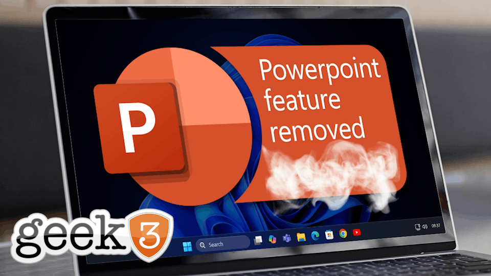
PowerPoint’s “Reuse Slides” feature lived squarely in that category.
And now it is gone.
Not with a dramatic announcement. Not with a warning that made it obvious what was about to happen. Just quietly removed, explained away as “duplicate functionality,” and left for users to discover the hard way when muscle memory fails and the button is no longer there.
If you are a casual PowerPoint user, this probably did not affect you at all. You might not even know what Reuse Slides was. You might be wondering what the fuss is about.
If you build decks for a living, or even just regularly, you noticed immediately.
Reuse Slides was the difference between building a presentation and assembling one. It allowed you to browse another deck, select exactly the slides you wanted, and decide whether to keep the original formatting. That last part was critical. Branding, layout, typography, spacing, and visual consistency matter far more than most people realize, especially in client facing material.
This was not a flashy feature. It was a practical one. And like many practical things inside Microsoft products, it was doing real work quietly, efficiently, and without asking for attention.
Which may be exactly why it was so easy to remove.
Why This Feature Mattered More Than It Looked Like It Did
On the surface, Reuse Slides sounds trivial. You can already copy and paste slides. You can open two presentations and drag slides from one to another. Technically, yes. Functionally, sort of.
But Reuse Slides existed because those methods are not the same.
It gave you control. It let you decide whether the incoming slides should adopt the destination theme or preserve the original formatting. It let you selectively pull slides from large decks without juggling windows, guessing which slide was which, or dragging things back and forth like you were rearranging furniture in the dark.
For organizations that care about consistency, this mattered. Sales teams, marketing departments, consultants, trainers, and executives reuse material constantly. Proposals evolve. Decks are cloned, modified, stripped down, built back up, and repurposed for new audiences.
The fastest way to introduce errors is to rebuild slides manually. The fastest way to break brand standards is to copy and paste content without preserving formatting. Reuse Slides helped prevent that.
It saved time, yes. But more importantly, it reduced risk.
That is the part Microsoft seems perpetually blind to.
Microsoft’s Explanation and Why It Falls Flat
Microsoft’s reasoning for removing Reuse Slides is that there were multiple ways to accomplish the same task, and maintaining overlapping features no longer made sense.
This explanation sounds reasonable if you evaluate software strictly from a feature checklist.
It collapses immediately if you evaluate software based on how people actually work.
Just because something can be done another way does not mean it should be. Capability is not the same thing as efficiency. Availability is not the same thing as usability.
You can still open a door without a handle. You just have to pull harder. You can drive without power steering. It technically works. You can cook dinner without a stove. Fire exists.
None of that makes it a good idea.
Drag and drop is not a replacement for Reuse Slides. It is a workaround. And workarounds are almost always slower, sloppier, and more error prone than purpose built tools.
Anyone who has ever watched PowerPoint silently substitute fonts, shift text boxes, or resize images knows exactly how fragile drag and drop can be. Sometimes it works perfectly. Sometimes it does not. And you do not always notice the damage immediately.
Microsoft evaluated duplicate functionality. Users evaluated time saved and mistakes avoided. Those are not the same metric.
The Real Problem Is Not This Feature
This is not really about PowerPoint.
It is about a pattern.
Microsoft has spent years “simplifying” its products. Menus get rearranged. Options disappear. Controls get buried. Features that were once explicit become implicit, or worse, unofficial.
In theory, this reduces clutter. In practice, it often removes precision.
The people who feel this the most are not casual users. They are the daily operators. The people who live inside these tools. The ones who know exactly where things are because they use them hundreds of times a week.
Simplification almost never hurts the person who opens PowerPoint once a quarter. It hurts the person who opens it every morning.
This is why these changes feel so frustrating. They are not improvements for the people doing the work. They are improvements for screenshots, onboarding flows, and marketing narratives.
And it is not limited to PowerPoint.
Windows 11 is a perfect example. Microsoft promised a simpler, cleaner experience. Yet shutting down a computer now requires more steps than it did in Windows 10. Settings are scattered. Familiar controls are hidden behind new abstractions.
Simpler, apparently, just means less visible.
The Cost of Removing “Small” Features
One of the most persistent myths in software design is that removing small features has a small impact.
It does not.
Small features are often workflow accelerators. They shave seconds or minutes off common tasks. Individually, that seems insignificant. Collectively, it adds up quickly.
When a feature like Reuse Slides disappears, the cost is not dramatic. Nobody files an outage ticket. Nothing breaks catastrophically.
Instead, everyone loses a little time.
A few extra clicks here. A few formatting fixes there. A few moments of frustration when something does not quite come in right. Multiply that by every deck, every week, across every team.
That is real cost. It is just invisible.
Microsoft does not feel that cost. Users do.
Why This Erodes Trust in Mature Software
PowerPoint is not a new product. It is mature. People expect mature software to change slowly and predictably.
When long standing features disappear quietly, trust erodes. Not in a dramatic way, but in a subtle one. Users stop assuming that tools will behave the same way tomorrow as they did yesterday.
They start hesitating before learning features deeply. They stop investing in mastery. They treat the software as unstable ground rather than reliable infrastructure.
This is especially damaging in business environments, where training, documentation, and standard operating procedures rely on consistency.
When features vanish without clear communication, organizations accumulate training debt. People have to be retrained. Documentation becomes outdated. Tribal knowledge becomes less reliable.
None of this shows up in a product roadmap.
All of it shows up in lost productivity.
The “You Can Still Do It” Argument Misses the Point
Whenever features like this are removed, the same argument surfaces.
“You can still do it.”
Yes. You can still do many things the hard way.
You can still calculate expenses without spreadsheets. You can still manage projects without project management software. You can still debug servers without logs.
The existence of a workaround does not invalidate the value of a proper tool.
Reuse Slides was not redundant. It was refined. It existed because copying slides is not the same as reusing them cleanly and intentionally.
Microsoft did not remove a duplicate. It removed a shortcut that reflected how people actually work.
Why Power Users Are Always the Ones Paying the Price
There is an uncomfortable truth about mainstream software products.
Power users are rarely the primary audience anymore.
They are vocal, but they are not the growth metric. Casual users are. New users are. Screenshot friendly interfaces are.
This leads to a steady erosion of power features in the name of accessibility. The irony is that power users are often the ones teaching others, building templates, creating standards, and keeping organizations productive.
When you remove tools from power users, everyone downstream feels it eventually.
It is like rearranging a workshop so it looks clean and organized for visitors, while the mechanic now has to walk across the room every time they need a wrench.
The shop looks nicer. The work takes longer.
What Businesses Should Actually Do About This
Complaining feels good, but it does not fix anything.
If your business relies on PowerPoint for proposals, training, sales decks, or executive presentations, this change is not catastrophic. But it is real.
Acknowledge it.
Make sure your team knows the new workflow. Teach them how to drag and drop slides safely. Teach them how to check formatting after the fact. Build that extra time into your expectations.
Do not pretend the friction is not there. Pretending does not make it go away.
More broadly, recognize that this will not be the last time Microsoft removes something useful and calls it optimization. Build processes that assume tools will change, sometimes in unhelpful ways.
Flexibility matters more than feature lists.
This Is Why Simplicity Still Matters
Ironically, Reuse Slides was simple.
It did one thing. It did it well. It reduced cognitive load instead of adding to it. It respected the user’s intent.
That kind of simplicity is harder to design than flashy features. It does not show well in demos. It does not sell upgrades.
But it is what keeps people productive.
When software companies forget that, users notice. Even if it takes a while.
Final Thought
PowerPoint did not break when Reuse Slides was removed. The world did not end. Decks still get made.
But something useful was lost. And nothing better replaced it.
That is the frustrating part.
Progress is not just about adding new things. Sometimes it is about not removing the ones that quietly did the work.
If your business is feeling the slow accumulation of friction from changes like this, you are not imagining it. And you are not alone.
Simple still matters.
Even when Microsoft forgets that.