Let’s be honest. Notepad has never been the app you get excited about. It’s the paper napkin of Windows. You grab it, scribble something down, and toss it away without ceremony.
It’s there for quick ideas, a temporary paste bin, or the occasional panic note when you’re on the phone with IT and they’re firing off commands too fast for you to keep up.
And that’s exactly why people like it.
It’s instant. No loading screen. No “Sign in to continue.” No “update in progress.” You open it, type, save, done.
But now… Microsoft is giving Notepad a little style. And it’s the kind of upgrade that might actually matter more than you think.
From Dive Bar to… Slightly Nicer Dive Bar
If you think about it, Notepad is like your favorite old-school diner. Same booth you’ve been sitting in for years, coffee refilled without asking, and the menu hasn’t changed since the 80s.
Now imagine they replace the wobbly salt shaker, repaint the walls, and maybe, just maybe, stop serving water in cracked mugs.
That’s this update.
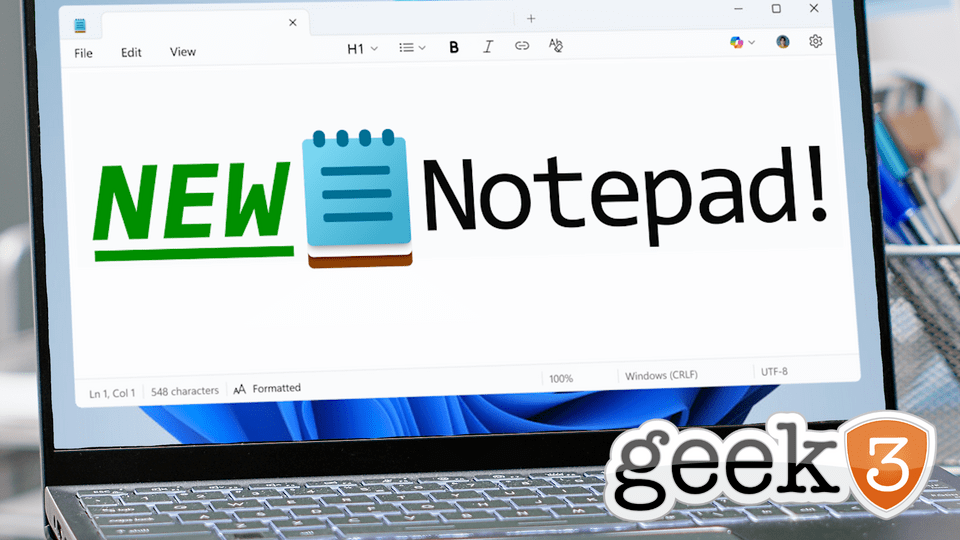
Microsoft isn’t turning Notepad into Word. They’re not adding ribbons, pop-ups, or AI sidebars (yet). Instead, they’re sprinkling in just enough formatting to make your notes easier to read without changing what makes Notepad… Notepad.
We’re talking:
- Bold and italic text (because sometimes something really matters)
- Headings (so meeting notes don’t look like one long run-on sentence)
- Bullet points (goodbye, messy dash lists)
- Hyperlinks (click instead of copy-paste)
All powered by markdown, the no-drama, quick-symbol language that’s been the internet’s favorite way to make plain text look decent for years.
Wait… Markdown?
If you’ve never used markdown before, think of it like ordering food at a taco truck. No fancy waiter, no 20-page menu… just shout your order in a few keywords and boom, you’ve got what you wanted.
In markdown:
**text**= bold*text*= italic# Heading= Heading- item= bullet point
No buttons. No complicated formatting menus. Just type symbols into your text, and it looks better instantly.
It’s the perfect “light” upgrade because the file is still plain text underneath. You could open it in an ancient version of Notepad and it would still work… it just wouldn’t look as pretty.
Why Should Businesses Care?
I can hear the skeptics now:
“Cool story, Microsoft. But I’m not formatting my grocery list.”
Fair. But this isn’t about shopping lists. This is about how something so basic can actually fill a real gap, especially now that WordPad is officially retired.
If you run a small business, you’ve probably been in this situation:
- You’re taking meeting notes in Notepad, but they’re messy and hard to skim.
- You send them to your team, and half the details get missed.
- The project timeline gets delayed because “I didn’t see that in the notes.”
With a few bold headings, a couple of bullet points, and maybe a link to the project folder, your notes are instantly clearer. No one has to wade through a block of text like it’s a wall of legal fine print.
And unlike using Word or Google Docs, you’re not bogged down in file conversions, slow load times, or “someone’s editing this right now” alerts.
The Middle Ground We Didn’t Know We Needed
There’s always been a big jump between “plain text” and “full document.”
Plain text is quick and light, but messy.
Full documents are polished but heavy.
This new Notepad sweetens the middle ground. You can create documents that are structured, skimmable, and, dare I say it, kind of nice to look at, without leaving the simplicity of a text file.
For internal checklists, meeting minutes, or brainstorming notes, this is huge.
But Won’t This Bloat the App?
One of the fears with adding features to a beloved simple tool is bloat. We’ve all seen it happen:
- The app starts fast.
- A few updates later, you’re waiting for splash screens.
- Then come the ads.
- Then the “Premium” subscription.
Microsoft claims this update is optional and lightweight. Don’t want formatting? Turn it off.
That’s the right move. It keeps the die-hard “plain text forever” crowd happy while giving everyone else a little more breathing room in their notes.
Real-World Use Cases
Let’s make this real for a second. Here’s where the new Notepad formatting could actually shine:
- Quick Project Outlines
Heading for the project name, bold for deadlines, bullet points for tasks. No more “where’s the important part?” scavenger hunts. - Client Call Summaries
A clean layout means less time re-explaining things later. Drop in clickable links to resources instead of typing out entire URLs. - Daily Team Standup Notes
Bold the blockers, bullet the wins, and keep everyone aligned… without wasting time in another doc. - Vendor Instructions
When you email your printer or contractor, clear formatting means fewer “wait, what?” replies.
For Personal Use
Even outside of business, this update has charm.
- Grocery Lists: Bold the essentials so you stop forgetting milk.
- Event Planning: Use headings for “Food,” “Decor,” and “Guests” so you don’t accidentally seat your vegan cousin next to the BBQ pit.
- Side Hustles: Track expenses, goals, and to-dos in a way you can actually read later.
Sometimes the smallest tools are the easiest to adopt because they don’t ask you to change how you work… they just make it smoother.
A Nostalgia Upgrade
Here’s the thing: Notepad is one of those rare pieces of software that hasn’t betrayed us. It hasn’t turned into a bloated service. It hasn’t tried to be “social.” It hasn’t locked behind a paywall.
This update keeps that spirit intact. It’s still the Notepad you grew up with, just… a little more grown up itself.
It’s the equivalent of your high school best friend showing up at the reunion in a fitted suit. Still the same person… just better at making an impression.
My Take
This is a smart move for Microsoft. Not because it’s flashy or groundbreaking, but because it shows they’re willing to modernize even the tiniest corners of Windows without overcomplicating them.
In a world where every app wants to be everything, restraint is rare. And in Notepad’s case, restraint is exactly the point.
The bottom line:
If you’re on Windows 11, keep an eye out for the update. Try bolding your next meeting header. Throw in some bullet points. Link that project folder instead of typing the whole path.
And if you hate it? Flip the switch and go back to the classic look.
But you might be surprised. Sometimes the smallest upgrades make the biggest difference.